
I typically will not turn to pink as a first thought for projects. Maybe because it seems so feminine and most of my clients are couples or families and I have to keep that in mind. But, pink is one of those overlooked colors that I truly enjoy working with when given the opportunity.
Soft pink is actually a color that enhances the skin tone. When the lighting in a space has a soft pink tone or “blush” hue, it can be quite flattering. I find that lining the interior of a lampshade with a soft pink silk quite well and does not scream that I have used pink in the space.
Additionally, I have added soft pink hues to the ceiling in which the reflection from the light sources have softened the space. The best use of this trick, I have found, are in dressing rooms, bedrooms, and bath areas where the pink undertones can reflect to flatter the skin.
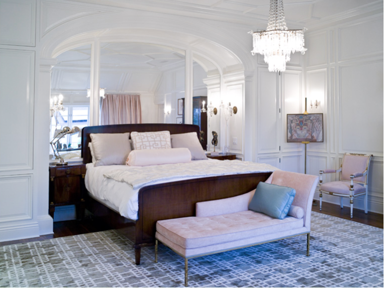
In the image above, Suzanne Kasler has successfully added pink upholstery that compliments the art. I like the use of it in a small dose here as it adds more impact.
I think this hue should be considered more often especially if trying to soften an area or create a romantic mood. Maybe I’ll have another opportunity soon.

My favorite ways to introduce a hint of pink into a space:
- wall paint especially on the ceiling
- lampshade interior lining
- artwork and accessories
- fresh cut flowers
- small doses of upholstery like a bench or chair seat
- pillows and throws
- bed sheeting
photo credit// image 1: suzannekasler.com // image 2: windsorsmithhome.com