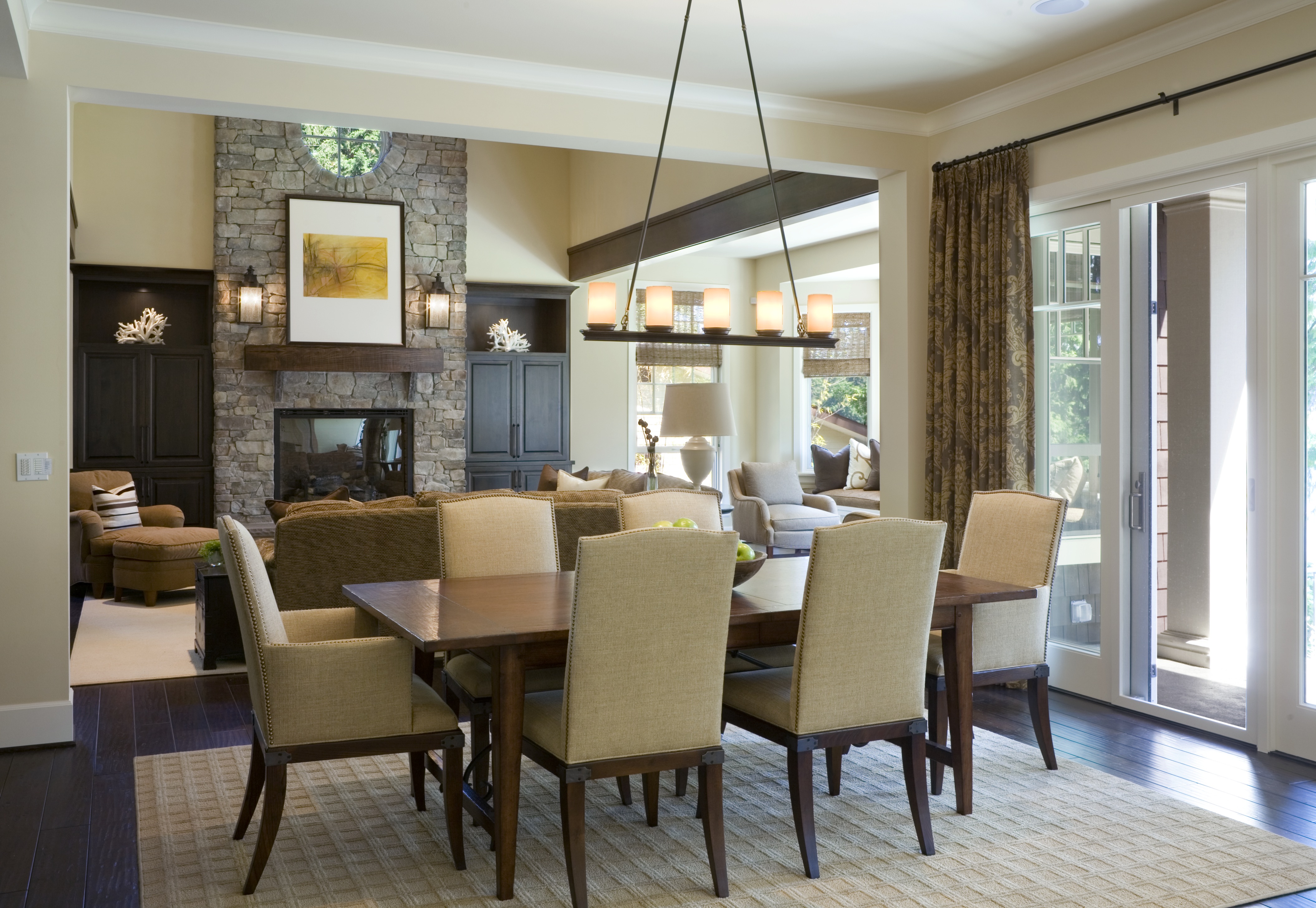
When I am working on a project, I always consider the “flow” from space to space. I consider the entire house and how each space relates to one another.
I try to find the one or two elements that create a commonality so that each room relates to the next in some way. One of the easiest and most obvious ways to accomplish this is though the use of color. It can be the color extracted from artwork or a fabric or a rug that ties everything together and translates to the next space. Sometimes, it is a metal finish or an architectural molding or even a light fixture. The goal is to have something that makes the next space read as a “cousin” if not a brother or sister. I often tell clients, that the rooms must say “hello” and they must not conflict (I must have heard that from some other designer or mentor at some point and it stuck).
Whether adjacent spaces are closed off or open to one another, a simple way to create the flow is by painting the molding the same color from room to room. As a trick, I sometimes reverse the molding color in the adjacent space to be the wall color. It is a great way to add intrigue while keeping the commonality especially if there is a transition between the spaces like a door or flooring change.
Check out a couple of these interesting spaces by Nate Berkus…

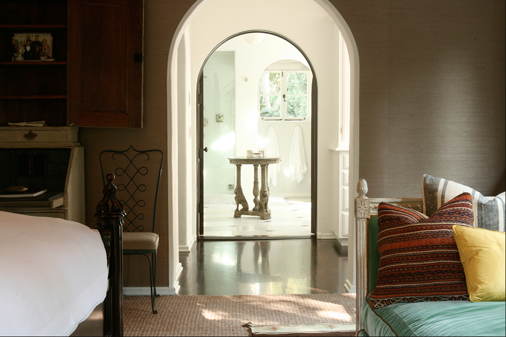
The pale green color is repeated in the cushion and bath tile while the textured grass cloth wall color is repeated in the table finish centered on the bath.
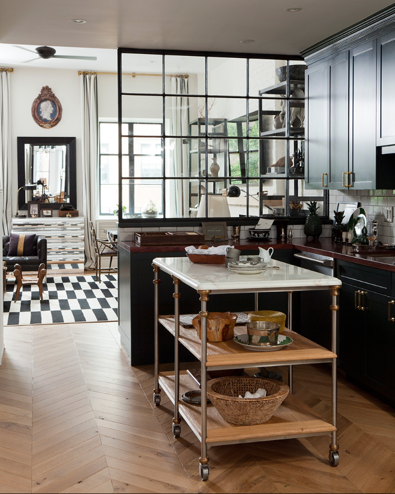
Repeating the black cabinetry color with the area rug in the adjacent space, keeps it relatable and interesting.
Photo credits// image1: dixiestark.com// image 2 and 3: nateberkus.com