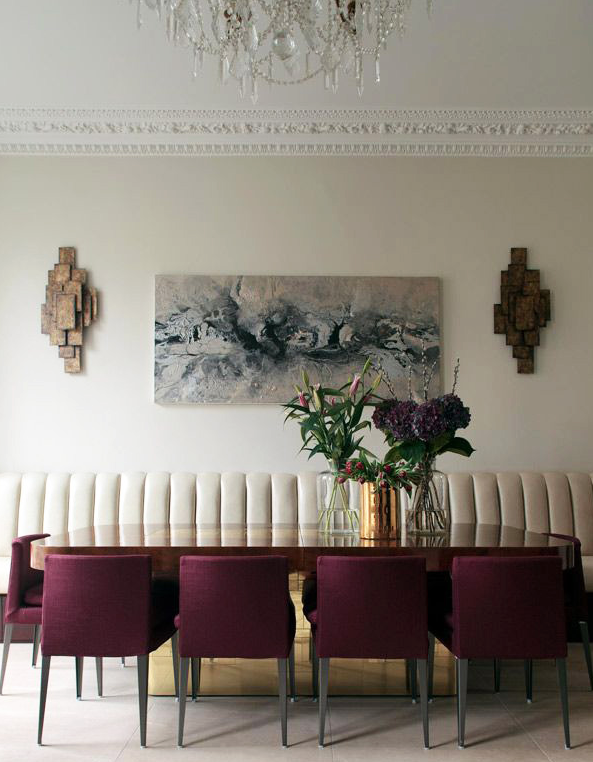
It’s back! That color I never loved as a kid in the eighties that was casting on everything everywhere in the interiors world, burgundy! I remember how every dining room, every library, every office seemed to have burgundy walls and of course, accented with hunter or teal green!
Well, this time it is not just called burgundy, but bordeaux or marsala (pantone.com) or oxblood, and it’s better! It’s a bit more fresh with a little less brown pigment and more of a purple undertone just like wine. And, oddly enough, I am not as opposed to it. I think that today’s burgundy used with restraint, can be quite lovely and sophisticated. As shown in the image above, just the chairs have the “kiss” of burgundy while the background of the space is still soft and neutral thus making the chairs more impactful.
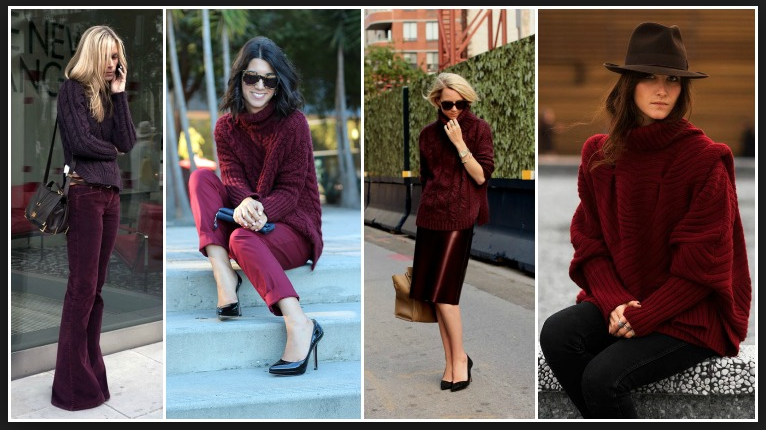
I am noticing burgundy is popping up even more this season in the fashion world which is always the precursor for the interiors world. Check out these great fashion looks in this hot color as burgundy makes a rebound. I can embrace this!

photo credits: image 1: theluxpad.com// image 2: forms.vogue.es